
Scatter plotting in python
Published:
In the past year or so, I’ve become a full-fledged tidy data convert. I use pandas and seaborn for almost everything that I do, and any time I figure out a new cool groupby trick I feel like I’ve PhD-leveled up.
That’s why it’s so frustrating that I still can’t find a good way to plot categorical scatterplots.
I want:
- an easy way to plot a scatterplot where the points are colored according to an associated categorical variable.
- to be able to manipulate this plot on the Axes object level (so that I can place it wherever I want, and so I can modify parameters after making the plot)
- to be flexible with respect to my categorical variables (i.e. I don’t want to hard-code any of them in, so that the plot is automatically updated if the number/identities of my categories change)
- the code to be elegant and in the spirit of tidy data!
Seaborn
As a tidy data convert, my first go-to is almost always seaborn. Seaborn is great and I highly encourage everyone plotting in Python to get used to it. Functions for different types of plots all take basically the same inputs, so it’s trivial to change your barplot into a boxplot and so on. It’s also really easy to slice and dice your data in different ways: you just tell seaborn which column is the x axis, y axis, color, etc. It’s also really nice because you can usually make a nice-looking plot with one line of code!
That said, every time I want to plot a scatterplot with points colored according to a categorical variable, I furiously google and StackOverflow and end up with the following options that might be able to do what I want.
import matplotlib.pyplot as plt
import pandas as pd
import seaborn as sns
%matplotlib inline
sns.set_style('white')
df = sns.load_dataset('iris')
df.head()
| sepal_length | sepal_width | petal_length | petal_width | species | |
|---|---|---|---|---|---|
| 0 | 5.1 | 3.5 | 1.4 | 0.2 | setosa |
| 1 | 4.9 | 3.0 | 1.4 | 0.2 | setosa |
| 2 | 4.7 | 3.2 | 1.3 | 0.2 | setosa |
| 3 | 4.6 | 3.1 | 1.5 | 0.2 | setosa |
| 4 | 5.0 | 3.6 | 1.4 | 0.2 | setosa |
lmplot
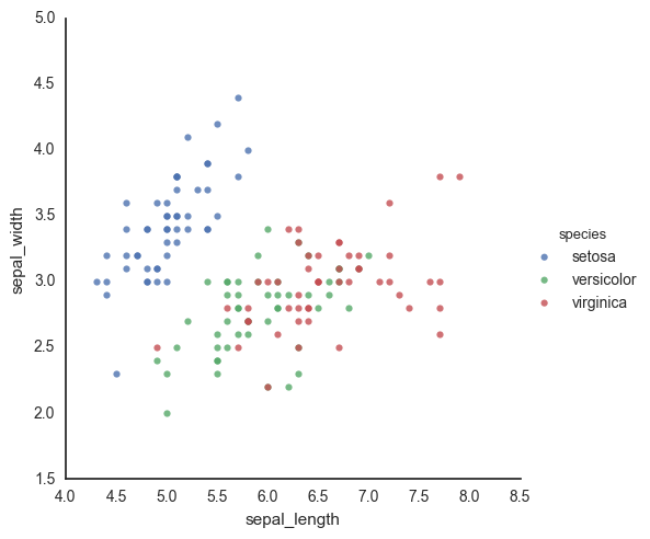
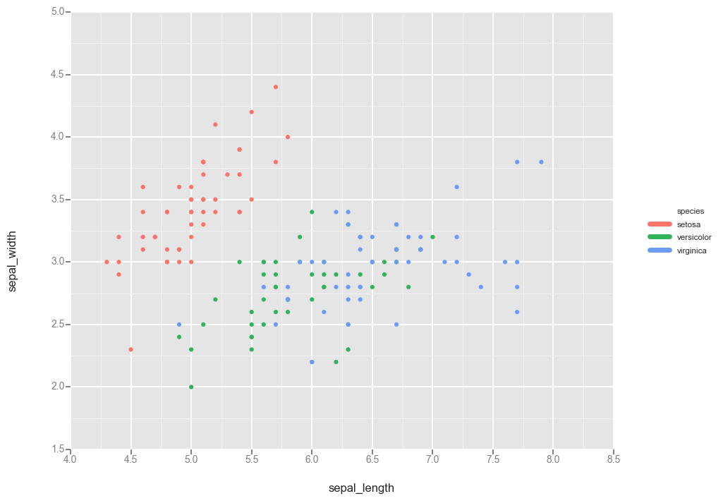
lmplot seems like the obvious first choice, since it makes the plot I want. lmplot is a wrapper around regplot, which makes a scatter plot of x vs y-variables, and fits a regression to the relatinoship. When you turn off the regression, it’s just a scatterplot. lmlplot wraps this functionality into a FacetGrid so that you can split your data according to a hue variable (and do the regression on each category separately).
However, it makes and returns a new FacetGrid instance, and it’s unclear to me how to interact with the underlying Axes object. Also, there isn’t any way to pass an existing Axes instance to the function, and so I can’t put this plot on an existing figure (e.g. that I made using plt.subplots() or with GridSpec). I’m forced to have this be its own new stand-alone figure.
sns.lmplot(data=df, x='sepal_length', y='sepal_width', hue='species', fit_reg=False)
<seaborn.axisgrid.FacetGrid at 0x117652090>
fig, ax = plt.subplots()
sns.lmplot(data=df, x='sepal_length', y='sepal_width', hue='species', fit_reg=False, ax=ax)
---------------------------------------------------------------------------

TypeError                                 Traceback (most recent call last)

<ipython-input-7-98860edd7ae0> in <module>()
      1 fig, ax = plt.subplots()
----> 2 sns.lmplot(data=df, x='sepal_length', y='sepal_width', hue='species', fit_reg=False, ax=ax)


TypeError: lmplot() got an unexpected keyword argument 'ax'

pointplot
This is another option I always forget about until I’m well into the rabbit hole (surprisingly, it doesn’t come up often in my google searches). That said, maybe the reason it doesn’t come up is that it actually doesn’t do what I want. I’m not sure how to use this function to plot the individual points. This plotting function aggregates the points in each category with an estimator, and the documentation even makes this explicit:
It is important to keep in mind that a point plot shows only the mean (or other estimator) value
There go all my hopes and dreams…
ax = sns.pointplot(data=df, x='sepal_length', y='sepal_width', hue='species')
ax.set_xticklabels(ax.get_xticklabels(), rotation=45)
fig.tight_layout()
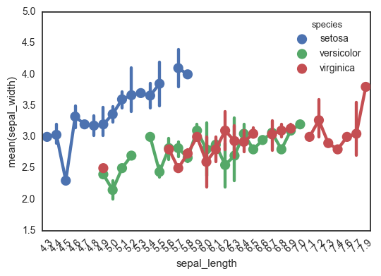
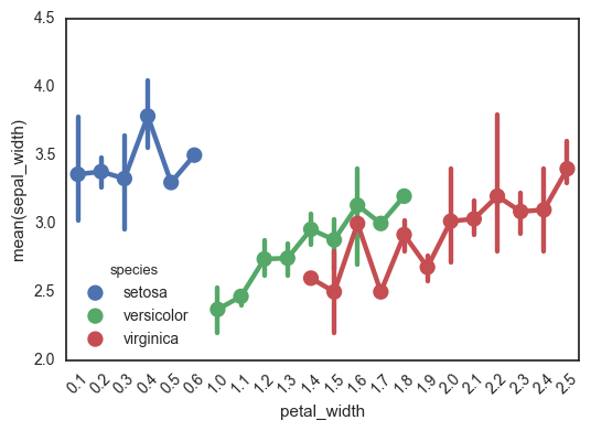
Another really important caveat with this function is that it treats the x-axis as categorical values - I’ve been tripped up by this before! This can really mess up your interpretation of the graph, if you’re expecting to look for a relationship between continuous x and y-values. This is definitely not the right kind of plot for this.
In the following plot, for example, look at how the x-axis jumps from 0.6 to 1.0. Ruh roh!
ax = sns.pointplot(data=df, x='petal_width', y='sepal_width', hue='species')
ax.set_xticklabels(ax.get_xticklabels(), rotation=45)
fig.tight_layout()
FacetGrid
Finally, we can go old-school FacetGrid + plt.scatter (I don’t know why this registers are “old-school” in my mind but it does). Again, however, this returns a FacetGrid that you can’t easily manipulate or move around. Womp womp.
g = sns.FacetGrid(data=df, hue='species')
g.map(plt.scatter, 'sepal_length', 'sepal_width')
<seaborn.axisgrid.FacetGrid at 0x119174f10>
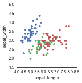
Because seaborn is a statistical plotting package, it tends to focus on making doing fancy things easier (while often times making doing easy things fancier…) This is one of those instances where it’s not totally clear to me how to just plot the raw data.
ggplot
Okay fine maybe seaborn is too fancy to actually do this simple thing. Obviously what I want is to recapitulate R’s ggplot functionality so why not use Python’s own ggplot?
Answer: honestly, because it’s a bit too early in its development and I find the lack of documentation frustrating. For example, I can’t seem to find whether you pass in an Axis instance to the ggplot call somewhere to specify where to make the plot.
import ggplot as gg
gg.ggplot(df, gg.aes(x='sepal_length', y='sepal_width', color='species')) + gg.geom_point()
<ggplot: (294909377)>
I also found that ggplot does a terrible job of dealing with nan’s in the categorical value, considering them each an individual category. I imagine this has to do with the behavior of set, which also does not collapse nan’s together.
import numpy as np

dfnan = df.append(pd.DataFrame(data=np.random.uniform(size=(4,5), low=4, high=8), columns=df.columns), ignore_index=True)
dfnan.loc[df.shape[0]:, 'species'] = np.nan
dfnan.tail(10)
| sepal_length | sepal_width | petal_length | petal_width | species | |
|---|---|---|---|---|---|
| 144 | 6.700000 | 3.300000 | 5.700000 | 2.500000 | virginica |
| 145 | 6.700000 | 3.000000 | 5.200000 | 2.300000 | virginica |
| 146 | 6.300000 | 2.500000 | 5.000000 | 1.900000 | virginica |
| 147 | 6.500000 | 3.000000 | 5.200000 | 2.000000 | virginica |
| 148 | 6.200000 | 3.400000 | 5.400000 | 2.300000 | virginica |
| 149 | 5.900000 | 3.000000 | 5.100000 | 1.800000 | virginica |
| 150 | 7.074309 | 7.972696 | 7.909355 | 4.219897 | NaN |
| 151 | 4.458424 | 4.172552 | 6.849114 | 7.951780 | NaN |
| 152 | 4.502440 | 5.012546 | 7.600676 | 4.141593 | NaN |
| 153 | 4.138379 | 5.966933 | 7.956917 | 7.337878 | NaN |
gg.ggplot(dfnan, gg.aes(x='sepal_length', y='sepal_width', color='species')) + gg.geom_point()
---------------------------------------------------------------------------

KeyError                                  Traceback (most recent call last)

/Users/claire/anaconda/lib/python2.7/site-packages/IPython/core/formatters.pyc in __call__(self, obj)
    670                 type_pprinters=self.type_printers,
    671                 deferred_pprinters=self.deferred_printers)
--> 672             printer.pretty(obj)
    673             printer.flush()
    674             return stream.getvalue()


/Users/claire/anaconda/lib/python2.7/site-packages/IPython/lib/pretty.pyc in pretty(self, obj)
    381                             if callable(meth):
    382                                 return meth(obj, self, cycle)
--> 383             return _default_pprint(obj, self, cycle)
    384         finally:
    385             self.end_group()


/Users/claire/anaconda/lib/python2.7/site-packages/IPython/lib/pretty.pyc in _default_pprint(obj, p, cycle)
    501     if _safe_getattr(klass, '__repr__', None) not in _baseclass_reprs:
    502         # A user-provided repr. Find newlines and replace them with p.break_()
--> 503         _repr_pprint(obj, p, cycle)
    504         return
    505     p.begin_group(1, '<')


/Users/claire/anaconda/lib/python2.7/site-packages/IPython/lib/pretty.pyc in _repr_pprint(obj, p, cycle)
    699     """A pprint that just redirects to the normal repr function."""
    700     # Find newlines and replace them with p.break_()
--> 701     output = repr(obj)
    702     for idx,output_line in enumerate(output.splitlines()):
    703         if idx:


/Users/claire/anaconda/lib/python2.7/site-packages/ggplot/ggplot.pyc in __repr__(self)
    114
    115     def __repr__(self):
--> 116         self.make()
    117         # this is nice for dev but not the best for "real"
    118         if os.environ.get("GGPLOT_DEV"):


/Users/claire/anaconda/lib/python2.7/site-packages/ggplot/ggplot.pyc in make(self)
    626             self.apply_scales()
    627
--> 628             legend, groups = self._construct_plot_data()
    629             self._aes.legend = legend
    630             for _, group in groups:


/Users/claire/anaconda/lib/python2.7/site-packages/ggplot/ggplot.pyc in _construct_plot_data(self)
    371
    372             mappers[aes_type] = { "name": colname, "lookup": mapper }
--> 373             data[colname + "_" + aes_type] = self.data[colname].apply(lambda x: mapper[x])
    374             self._aes.data[aes_type] = colname + "_" + aes_type
    375


/Users/claire/anaconda/lib/python2.7/site-packages/pandas/core/series.pyc in apply(self, func, convert_dtype, args, **kwds)
   2292             else:
   2293                 values = self.asobject
-> 2294                 mapped = lib.map_infer(values, f, convert=convert_dtype)
   2295
   2296         if len(mapped) and isinstance(mapped[0], Series):


pandas/src/inference.pyx in pandas.lib.map_infer (pandas/lib.c:66124)()


/Users/claire/anaconda/lib/python2.7/site-packages/ggplot/ggplot.pyc in <lambda>(x)
    371
    372             mappers[aes_type] = { "name": colname, "lookup": mapper }
--> 373             data[colname + "_" + aes_type] = self.data[colname].apply(lambda x: mapper[x])
    374             self._aes.data[aes_type] = colname + "_" + aes_type
    375


KeyError: nan
I could probably dig into this more, but honestly I don’t really want to go down this rabbit hole. I’m just not hardcore enough to debug something that I know is still very early in development, and there isn’t enough documentation or StackOverflow posts about it to be worth the investment.
pandas
I could probably use pandas, but as this fun article points out, I haven’t really found any cases where plotting with pandas is particularly more elegant than just going straight to matplotlib.
matplotlib
So the first option with matplotlib is to manually define a dictionary mapping each categorical value to a color, as in this StackOverflow response.
df = sns.load_dataset('iris')
fig, ax = plt.subplots()
colors = {'setosa': 'red', 'versicolor': 'blue', 'virginica': 'green'}
ax.scatter(df['sepal_length'], df['sepal_width'], c=df['species'].apply(lambda x: colors[x]))
<matplotlib.collections.PathCollection at 0x11ad51510>
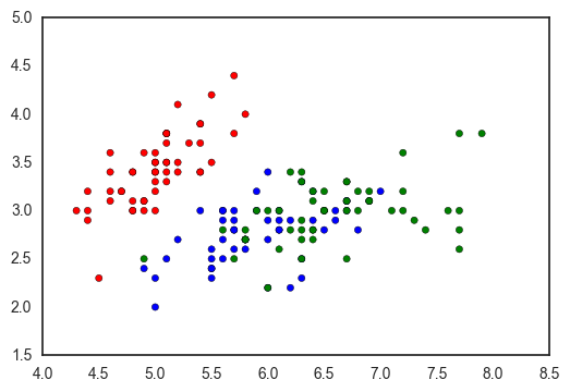
However, this has a few downsides:
- you have to manually set the color for each variable
- it breaks if there are values in your column which are not in the color mapping dict
- and it doesn’t seem to work with nan’s
- it’s pretty ugly
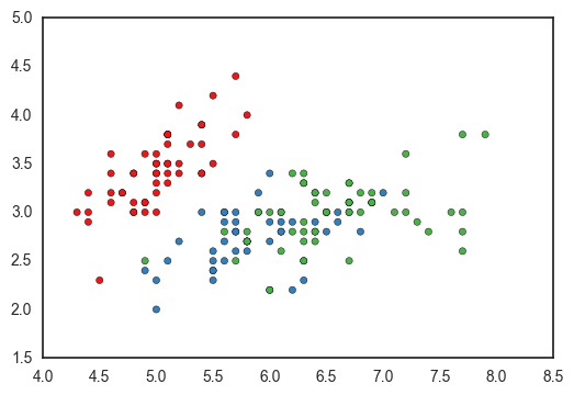
colors = {i: j for i, j in zip(df['species'].unique(), sns.color_palette('Set1', len(df['species'].unique())))}
fig, ax = plt.subplots()
ax.scatter(df['sepal_length'], df['sepal_width'], c=df['species'].apply(lambda x: colors[x]))
<matplotlib.collections.PathCollection at 0x11a3a3f90>
You could programmatically define the dictionary, but you’ll have to handle nans manually. Using nan as a dictionary key returns a KeyError because nan isn’t equal to itself (more here).
colors = {i: j for i, j in zip(dfnan['species'].unique(), sns.color_palette('Set1', len(dfnan['species'].unique())))}
fig, ax = plt.subplots()
ax.scatter(dfnan['sepal_length'], dfnan['sepal_width'], c=dfnan['species'].apply(lambda x: colors[x]))
---------------------------------------------------------------------------

KeyError                                  Traceback (most recent call last)

<ipython-input-19-70bb79154368> in <module>()
      1 colors = {i: j for i, j in zip(dfnan['species'].unique(), sns.color_palette('Set1', len(dfnan['species'].unique())))}
      2 fig, ax = plt.subplots()
----> 3 ax.scatter(dfnan['sepal_length'], dfnan['sepal_width'], c=dfnan['species'].apply(lambda x: colors[x]))


/Users/claire/anaconda/lib/python2.7/site-packages/pandas/core/series.pyc in apply(self, func, convert_dtype, args, **kwds)
   2292             else:
   2293                 values = self.asobject
-> 2294                 mapped = lib.map_infer(values, f, convert=convert_dtype)
   2295
   2296         if len(mapped) and isinstance(mapped[0], Series):


pandas/src/inference.pyx in pandas.lib.map_infer (pandas/lib.c:66124)()


<ipython-input-19-70bb79154368> in <lambda>(x)
      1 colors = {i: j for i, j in zip(dfnan['species'].unique(), sns.color_palette('Set1', len(dfnan['species'].unique())))}
      2 fig, ax = plt.subplots()
----> 3 ax.scatter(dfnan['sepal_length'], dfnan['sepal_width'], c=dfnan['species'].apply(lambda x: colors[x]))


KeyError: nan
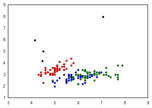
In my case, I ended up going with the ugly, manual, versatile matplotlib way to make my plot: replacing nan’s with strings, manually defining my dictionary, adding a column with the colors, and using groupby to plot - but only because I knew exactly what values I was expecting.
fig, ax = plt.subplots()
colors = {'setosa': 'red', 'versicolor': 'blue', 'virginica': 'green', 'nan': 'black'}
dfnan = dfnan.replace(np.nan, 'nan')
for c, subdf in dfnan.groupby('species'):
    ax.scatter(subdf['sepal_length'], subdf['sepal_width'], c=colors[c], label=c)
I feel like the scatterplot is one of the breads and butters of data visualization - and though I recognize why seaborn approaches it the way it does, I’m still so surprised that there’s no easy and versatile way to make a scatterplot colored by a categorical varaiable!
What do you use to make this common plot? Am I missing something obvious??!